The April issue of House Beautiful has landed, prompting me anxiously to complete the March issue which is all about green. Gosh it is hard to keep up, isn’t it? Anyway green is my favorite color without a doubt. The color of life and the color of harmony, as all greens go together. In the March issue is a wonderful feature on 10 green rooms that I especially liked for the designers’ comments on their respective designs and their very specific thinking behind them. I learned something (eg. “Green pigment was expensive in th 18th century, making it a status symbol…”) It’s a great little read.
The HB website also has a terrific assemblage of ”Gorgeous Green Rooms,” a few of which are highlighted here. They were even nice enough to include Bee Cottage, whose living room and garden room are green to the hilt.
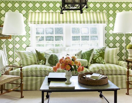

By Miles Redd:
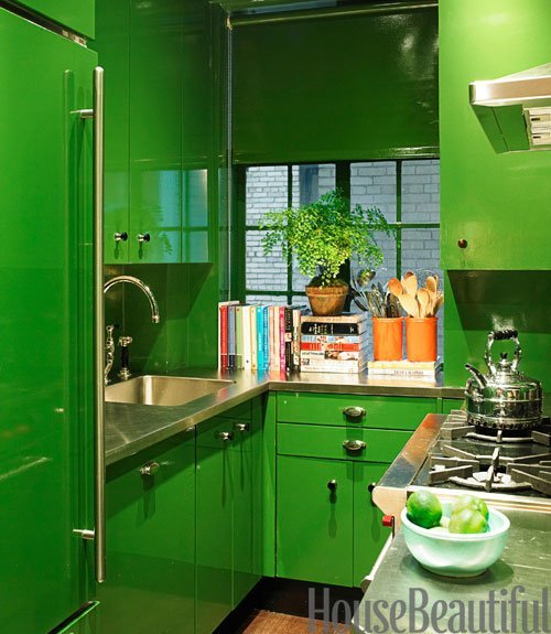
By Michele Allman:
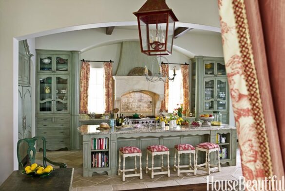
By Richard Norris and Mark Leslie:
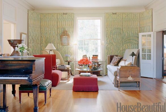
By Allison Paladino:
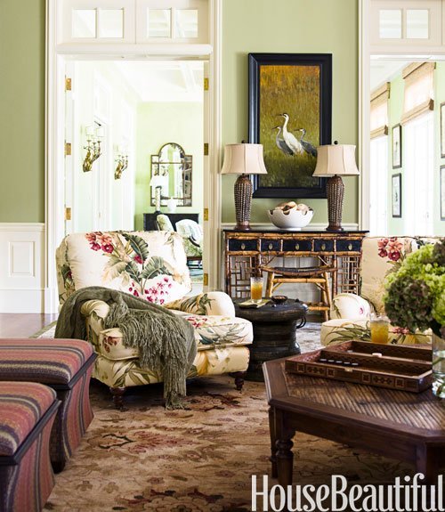
By Jean-Louis Deniot:
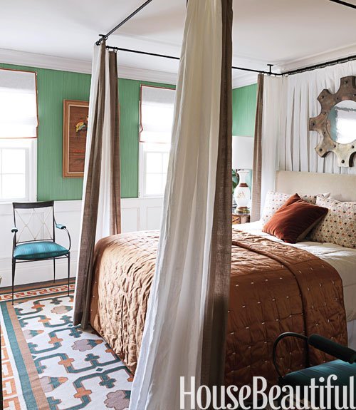
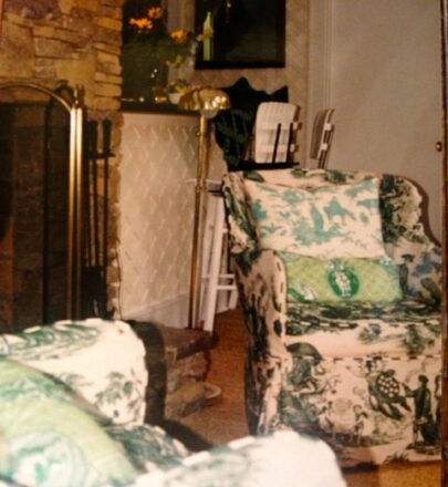
Years ago when I lived in Atlanta I had a house in Highlands, NC, not big as a minute. 3 rooms plus the kitchen, which was really part of the living room, and 2 bathrooms (thank goodness). Designer and friend John Oetgen and I did the whole living room in green toile, four different ones, plus a green and coral check. It was fab. That was a long time ago, and I’m sick I don’t have more and better photos. These look kinda pitiful next to the others, but I include them because there are some fun ideas here that might spark something for you. I named it Pavillon du Bois–pavillon in the woods–kind of as a joke. Double-wide in the woods was more like it.

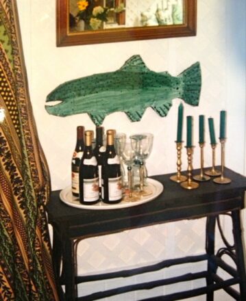
P.S. Full disclosure, and just so you know, the following images are somewhat more representative of John Oetgen’s work:

Photos courtesy House Beautiful, Oetgen Design, and me (you can tell which ones).


Thanks for the pictures on today’s post (3-16). I love to see what you’ve done!!
I LOVE this issue, Frances. Green is also one of my favorite colors…perhaps it is because I’m Irish (?). I’m dreaming about visiting Bee cottage one day. xx
Love them all, but your Bee Cottage’s Garden Room is still my fave!
Awww. Thank you Lori.
I love the chimney piece at the Highlands, NC, no matter what you say about the double-wide. And as for green being a great color, in Colonial times, it was used to reflect the light of the candles and the fireplace. I wish it were still mixed the exact same…
Kathleen, thank you. And actually you are right about that chimneypiece. It was a work of art, with tree trunks on either side and the branches extending upward. Built by one Keith Ashe, from Cashiers, NC, and artist and a great guy.
Love the Mose Tolliver.
Hello Frances,
On the hunt for a striking geometric green wallpaper to use in my garden dining room, I chanced upon your absolutely amazing garden room in Bee Cottage.
I don’t suppose you could tell me the brand of wallpaper you used in your garden room? It’s exactly what I’m looking for – the geometric design will echo the lines of my vintage brass dining table and chairs perfectly!
Thank you!
Katie x
Hello Katie, are you English? If so you may be happy to know the wallpaper is, too, by Carlton Varney. So sorry I am traveling and do not have the pattern name at my fingertips. Dedar has some nice geometrics, too, and that China Seas bamboo-lattice-y one is a great classic as well. Good luck, and now I’m going to see What Katie Wore.com! Thanks for writing.
Frances, I so enjoyed the Bee Cottage series in House Beautiful, what wonderful inspiration! What a surprise to see you on the Nate Berkus show last Monday-a true Southern Belle! ps-many thanks for the card and book plates!