Veranda magazine’s new look is comfortingly like its old look. Gratifyingly the new table of contents for the features actually gives you an idea of what the feature contains. In the old iteration this was always a peeve of mine, and don’t think in the 10+ years I wrote for them I didn’t say so. What, I whined, does “An Idyllic Aerie” or “A Pretty Pastiche” tell you? Not all that damn much: Not where or what the subject was. Definitely not who the decorator was. Not who the writer was (ahem). It used to drive me crazy. But the divine Lisa Newsom and the magazine she founded in 1978 did a lot of things right, so who was I to complain.
Now with the estimable Dara Caponigro at the helm and Hearst the owner, a few changes are afoot, but they are subtle. If it ain’t broke, don’t fix it. Overall it has a crisper, fresher feel. The front-of-book departments have been revised; a few fonts are different; and the listing of features includes the name of the designer. Now I can see right up front that David Easton’s done a house in Aspen–yay! David is one of my favorites, and lo, this house belongs to his longtime client and friend, the fab first wife of His Grace (aka my cowboy sweetheart). I’ve been fortunate to be a guest in this house, and clearly the First Mrs. Dittmer (also named Frances, if you can believe) has a great eye for art as well as impeccable taste in interiors and cowboys.
The house following is by Kelli Ford and her sister Kirsten Fitzgibbons. Hmm, Kelli used to be married to my sister’s old boyfriend. I am not making this up. Is it a ridiculously small world or have I just been around so long that … don’t answer that.
I am delighted to share the projects of these two respected design firms here, though they couldn’t be more different. That they are in the same magazine is what makes the magazine exciting and fresh, even if it’s still singing the same three notes. The notes are beautiful.
Oh, and there is a very nice piece on acclaimed New York jeweler and friend Mish Tworkowski’s beautiful new downtown atelier in Bond Street, but we sure do miss him in the sleepy ol’ Upper East Side. Please do see and read the full features in the January-February issue of Veranda, out now.
All photographs here by Max Kim-Bee.
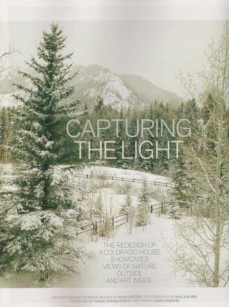
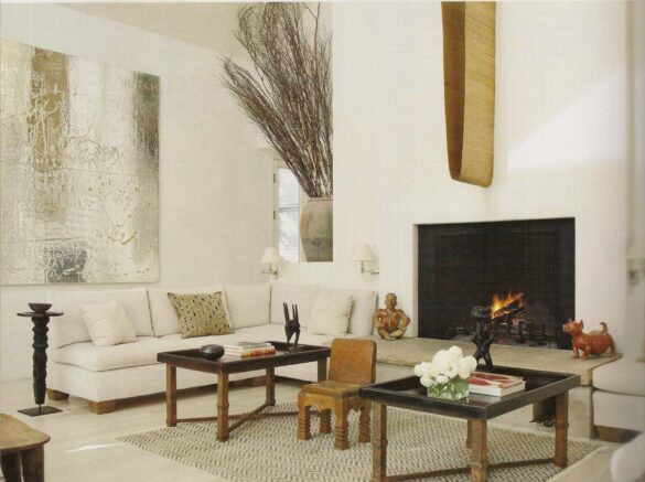
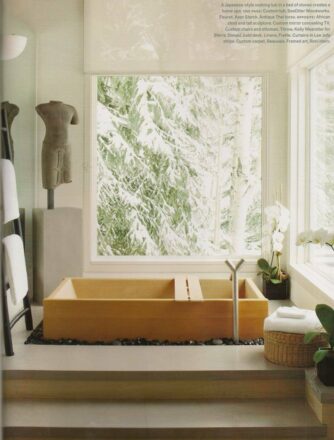
Of this Aspen project and the perhaps uncharacteristic minimalist aesthetic guiding it, designer David Easton said, “A simplified interior need not obliterate the richness of living or defeat the beauty of the past.” His use of neutrals, rich textures, organic elements, antiques, African textiles and totems creates warmth, while stunning and graphic contemporary art creates excitement, and a bit of an edge. The result is an environment that is alternately restful or stimulating, depending on your focus.


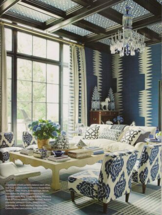
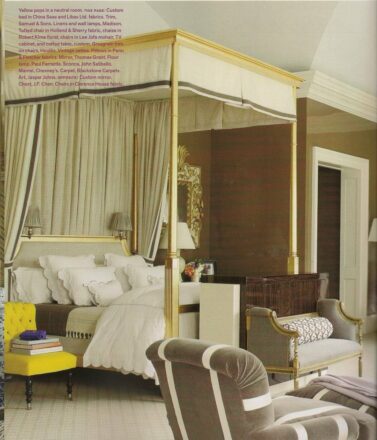
Vive la difference. I love the dramatic juxtaposition of these two projects, going from a whispered wow to a rather loud OMG…

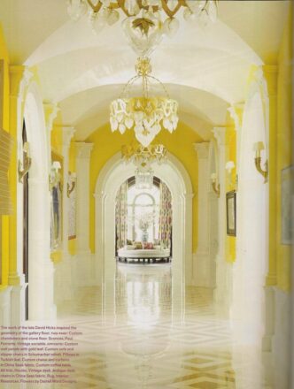
My first thought is of the scene from Gone With the Wind where Mammy trails behind Rhett and Scarlett entering their big, new house in Atlanta after the war. “Lawd Mistah Rhett,” Mammy exclaims, “we sho’ is rich now!” Nothing wrong with that, I hasten to add. This house is not in Atlanta but Dallas, and is ravishingly lived in by designer Kelli Ford and her family.



Veranda is certainly one of the best interior design magazines available. We owe so much to Lisa Newsom, who had an amazing vision for what she wanted to create. I am enormously grateful for the many opportunities that the magazine has provided me. And “new management” is doing a better and better job each issue! I look forward to reading it for another 20 years!
Oh, Mary Douglas, you are so right. Not only are the design and publishing worlds indebted to Lisa Newsom, they are enriched by her gracious manner and her generous spirit. She is just one of the loveliest people on the planet, and Veranda was and is a reflection of that. Heck of a legacy.
Hi, Frances. Thanks so much for including us on your blog! So appreciate it! And, I couldn’t agree more, Lisa Newsom is AMAZING! Happy New Year to you! Best, Dara
And if anyone could follow Lisa, you could my dear. Brava.
Kelli and Kirsten are a fabulous decorating duo, I have loved their collaborative work from day one. Bravo on another beautiful creation!
Absolutely, Debbie; I can’t wait to see what they do next…
Frannie, as always – your taste in art is impeccable, flawless…
Aw shucks, David, thank you. And great to hear from you!
Frances, it truly is a small world! Who is your sister?
With Dara Caponigro at the helm, expect great things and a magazine you will want to read!
Absolutely, Walter, couldn’t agree more. Thank you so much for writing, Frances